Repositioning a wellness brand from operational noise to sustainable clarity
Nordic Health House
Year
2018-2019
Summary
In 2018, Nordic Health House faced a clear problem: the business was losing 3.5 million DKK. The offering was unclear, the digital experience fragmented, and internal alignment missing. Practitioners managed their own content, and users couldn’t find the information they needed.
I was brought in to reframe the structure, simplify the system, and build a user experience that reflected what the business was actually trying to be. We used the resources already available—no new hires, no rebrand, no agencies. Just sharper decisions and practical execution.
Within 12 months, the business turned a profit and regained trust, both inside and out.
My Role
I led the project across strategy, digital structure, and visual execution:
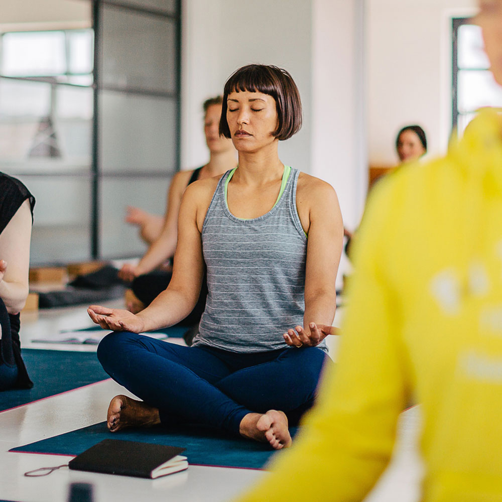
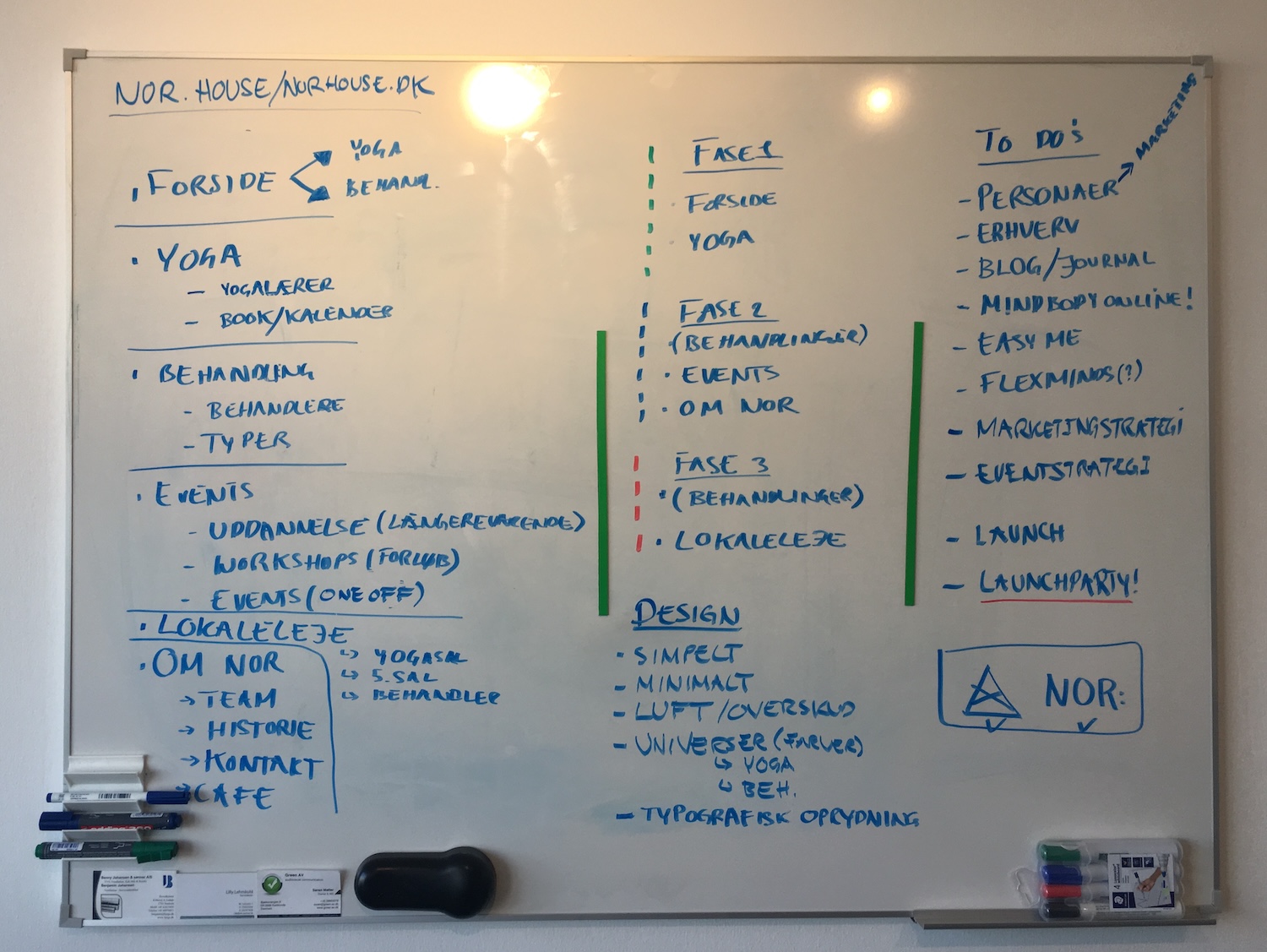
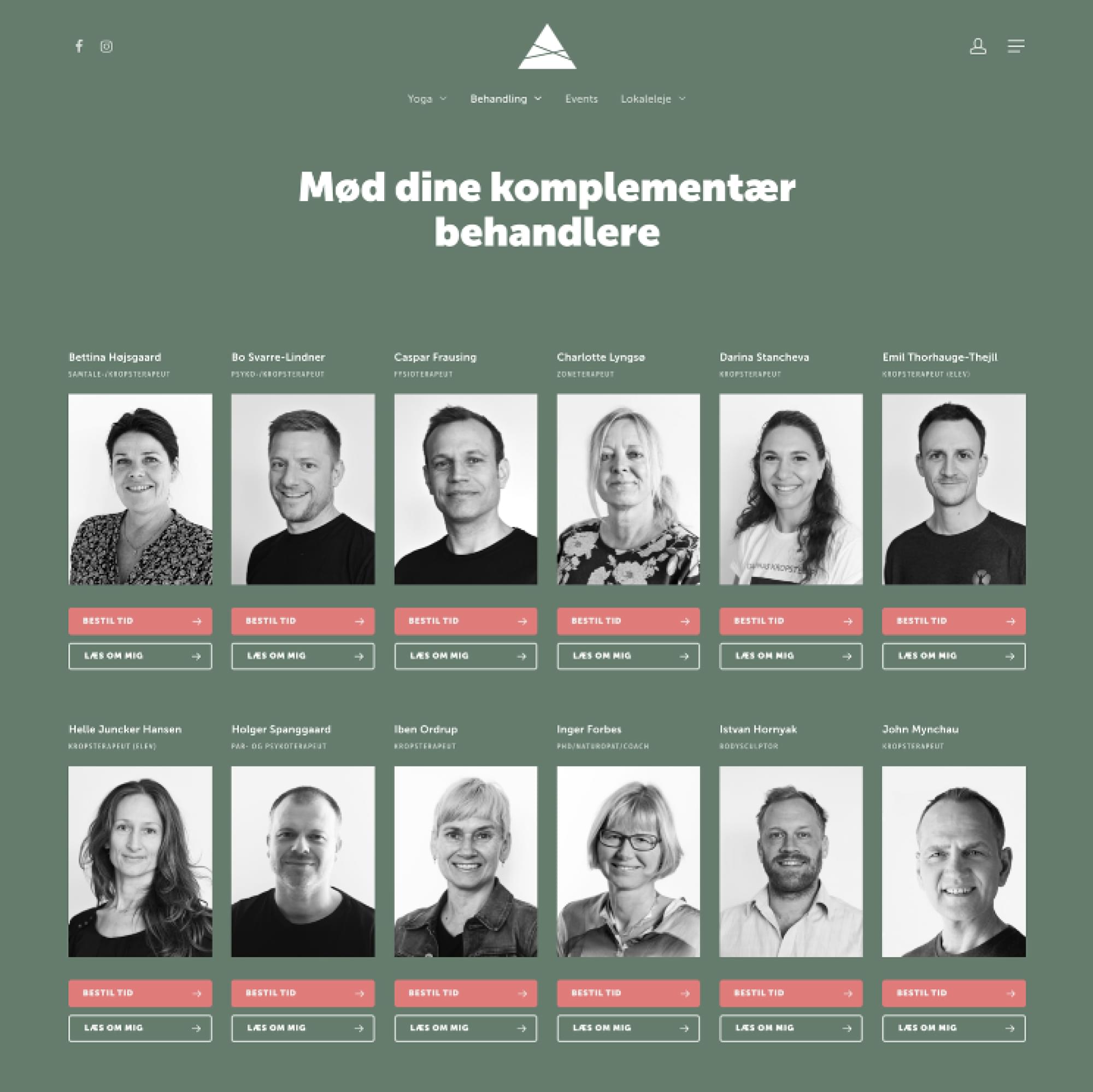
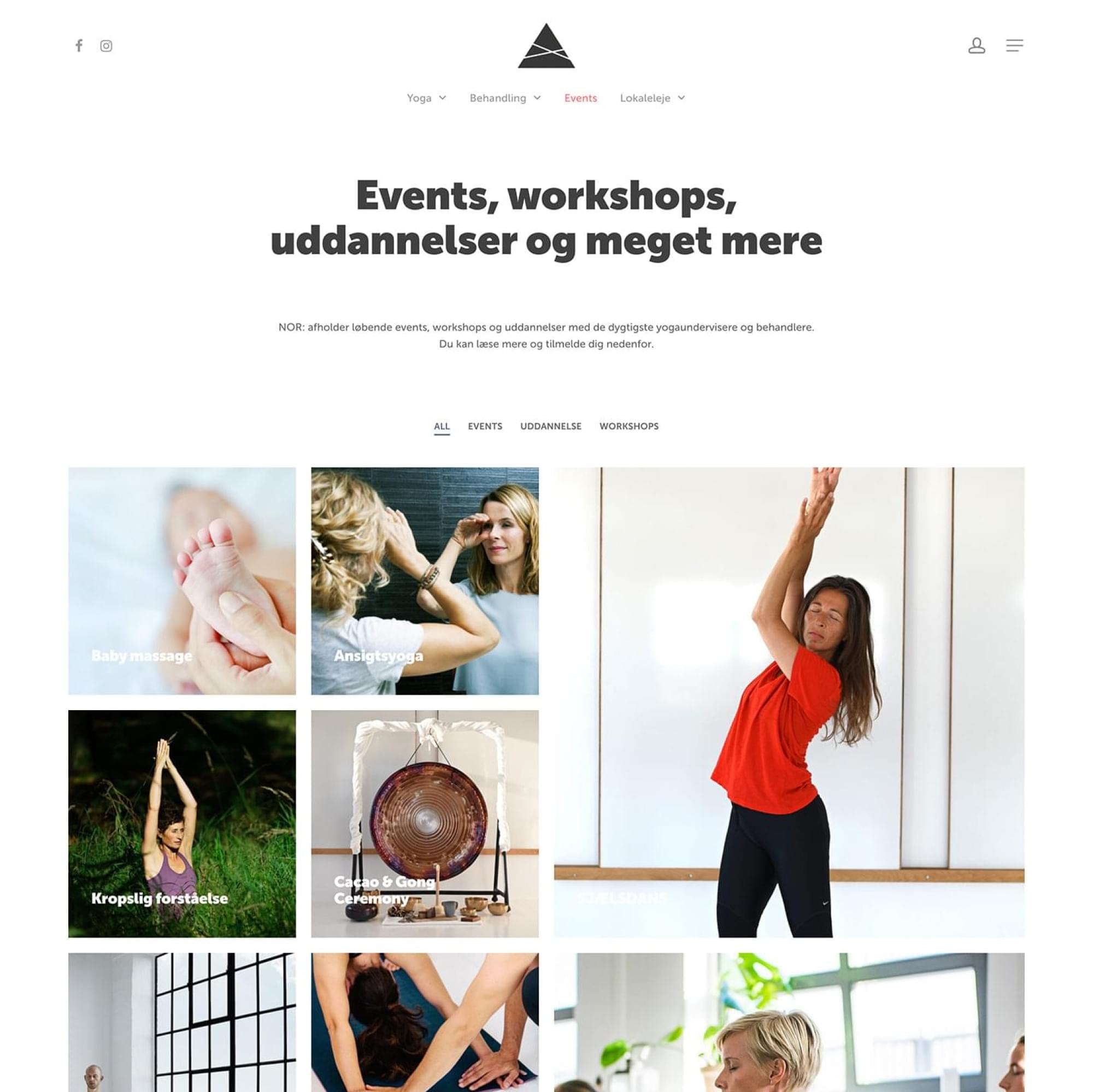
- Defined the new service model (Yoga, Treatments, Rentals)
- Rebuilt site structure and optimized booking UX
- Refined and simplified the existing brand system
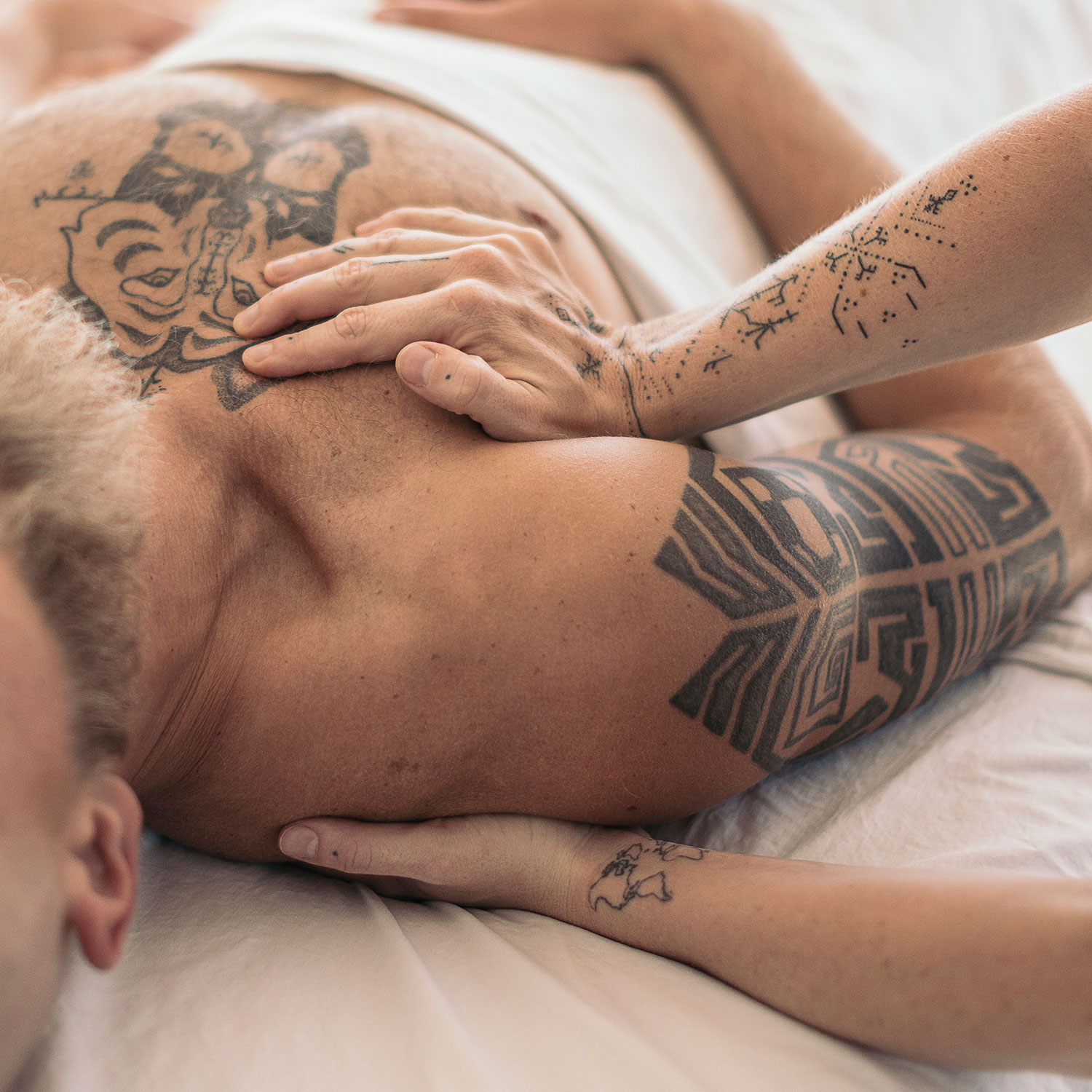
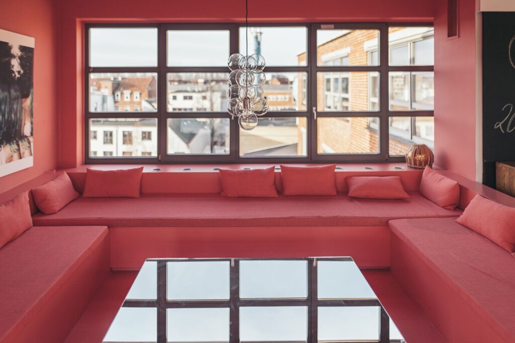
- Created a new photo library and internal content guidelines
- Collaborated directly with management and stakeholders during rollout
The Challenge
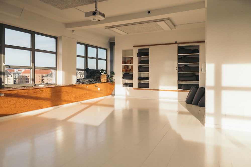
When Nordic Health House opened, it had potential—but no clear structure.
The service mix was fragmented. Yoga, treatments, and room rentals were all competing for attention, but there was no framework to connect them. The website was managed by individual tenants, not the business. Booking pages were buried, pricing was inconsistent, and the digital experience was reactive rather than intentional.
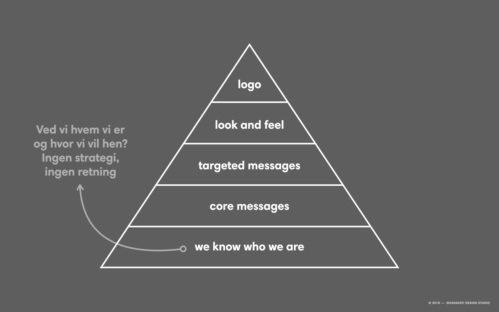
Internally, the team lacked a shared understanding of what NOR was—or how to present it.
Externally, users were confused.
The result: a 3.5 million DKK loss in the first year.
Mapping the starting point: disconnected offers, no shared structure, and inconsistent visibility
The Solution
The original digital setup wasn’t built for a business—it was a collection of individual priorities. Each practitioner managed their own page. Booking was hard to find. Pricing wasn’t consistent. The structure didn’t reflect a unified brand or user journey.
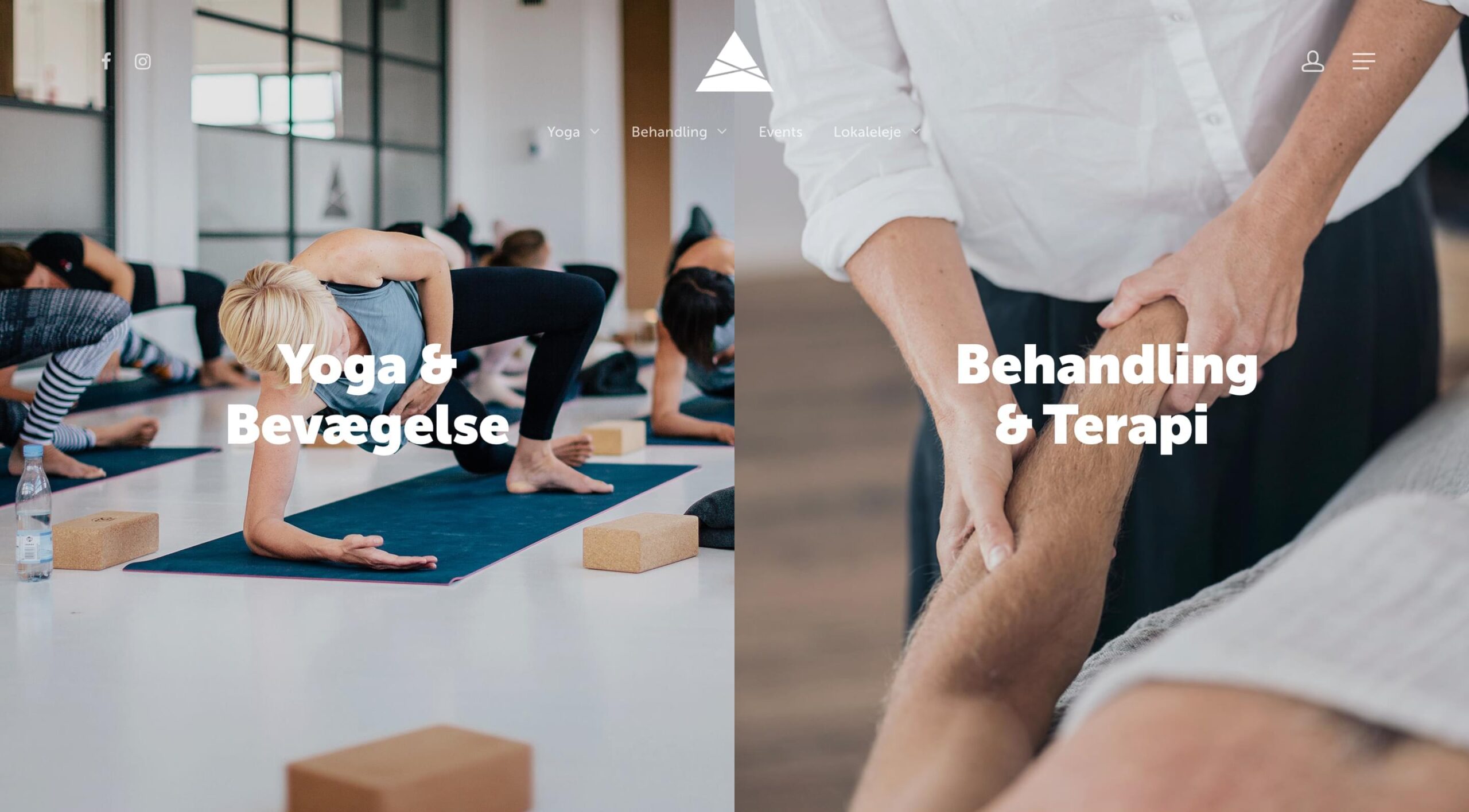
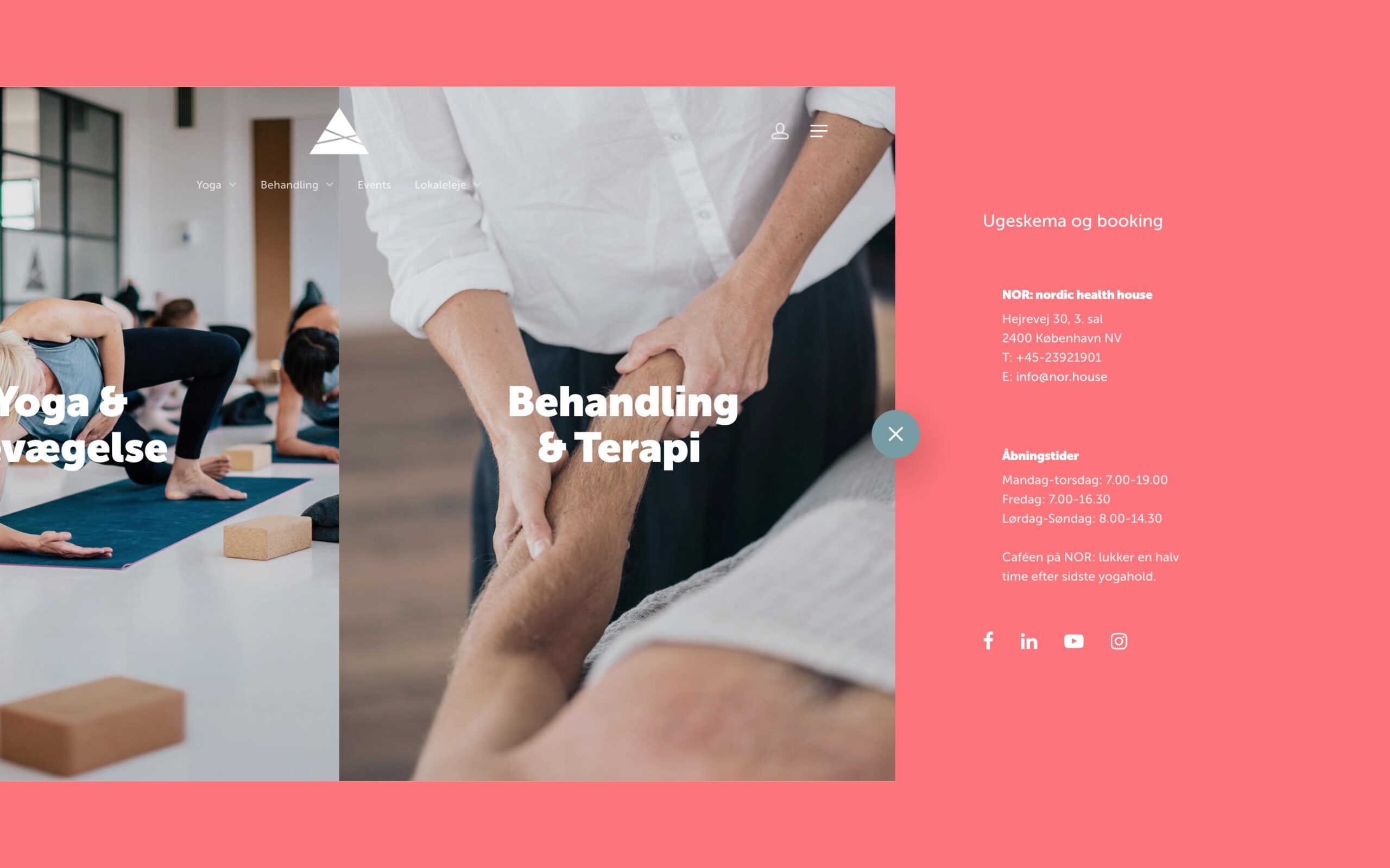
We reframed the offering around three core services:
Yoga. Treatments. Room Rentals.
This became the backbone of both the user experience and the internal logic. Navigation was rebuilt. Content was restructured. Every service got equal space—so the experience reflected the full business, not just its parts.
Internally, the change brought clarity and ownership. Stakeholders who had previously competed for visibility now shared a system that made sense—for users and for the team running it.
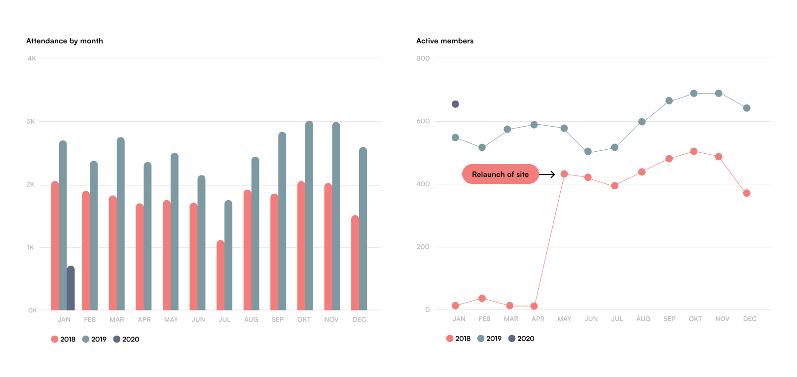
Class and session attendance followed. With better structure and clarity, users found and booked sessions more consistently, especially post-summer.
After restructuring, membership grew rapidly. From near-zero visibility in early 2018 to over 400 active members in five months—and trending upward.
Execution
Everything was done using the existing team and budget.
No new hires. No agency. No rebrand.
We used a clean WordPress theme and built out a clear booking flow. I refined the frontend with custom CSS where needed and focused the entire experience around the three new service pillars.
The visual identity stayed intact—but I simplified how it was used. Fewer logo variants. A more consistent tone. And a new photo library to replace stock visuals with real, place-based imagery.
The internal rollout wasn’t smooth—but it held. The new structure removed confusion and restored ownership to management. What started with hesitation ended in alignment.
Customer Experience
Before the restructure, users struggled to navigate the site.
Services were scattered across independently managed pages, booking was inconsistent, and pricing wasn’t always visible.
After the relaunch, everything changed. The three-pillar model gave users a clear entry point. Navigation became intuitive. Bookings were surfaced early. Content was rewritten to prioritize clarity and trust.
The digital experience didn’t just reflect the business—it supported it. The site became the primary way people engaged with NOR, from discovery to booking.
I designed and built the site directly inside the WordPress theme, no external handoff.
Every flow, page structure, and copy block was optimized in real time for usability and clarity.
The goal wasn’t to show off design. It was to make every decision, from landing to booking, feel effortless.

Outcome
Within 12 months, Nordic Health House went from a 3.5M DKK loss to profitability.
Bookings stabilized. Room rentals reached full occupancy.
The visual and structural changes stuck—because the internal team could run everything themselves.
The brand didn’t need a redesign. It needed decisions that made the business usable again. That’s what this project delivered.
Visit site → nor.house